Heuristics offer guidance for assessing a design and recognizing potential design issues. It is an approach to testing a service by applying heuristics to uncover usability issues. In this project, I and my team will do a heuristic evaluation to assess the usability of the eBay website and suggest design improvements.
Heuristic evaluation contributes to enhancing key aspects such as:
Boosting user engagement
Reducing bounce rate
Increasing click-through rate
violation severity
Rate of occurrence
Impact
Duration of Effect
Severity Rating legend
0 = No Issue
1 = Cosmetic
2 = Minor Usability
3 = Major Usability
4 = Usability Catastrophe
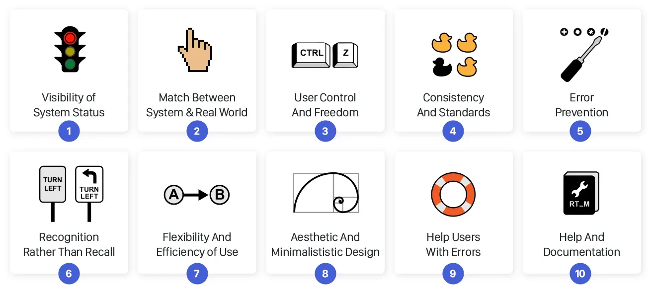
#4
Consistency and standard
#8
Aesthetic and minimal design
#1
Visibility of system status
#6
Recognition rather than recall
#3
User control and freedom
Project Constraints
8 point grid system
Colors
Iconography
Typography
Market Sans
Arial
Sans-serif
Helvetica Neue
Helvetica
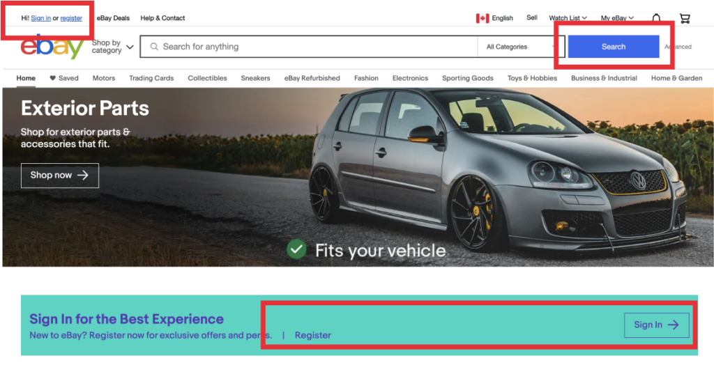
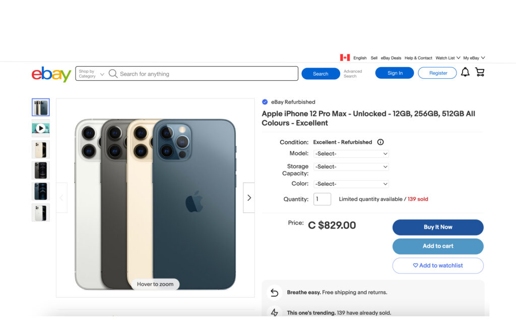
#4: Consistency and standards
Before:
Due to inconsistent buttons & fonts, the user does not know where to go to access the main CTA.
Solution (after):
Moved the sign-in link to the top right side of the screen and make all buttons consistent. Make sign-in to eBay more streamlined with today’s e-commerce competitors.
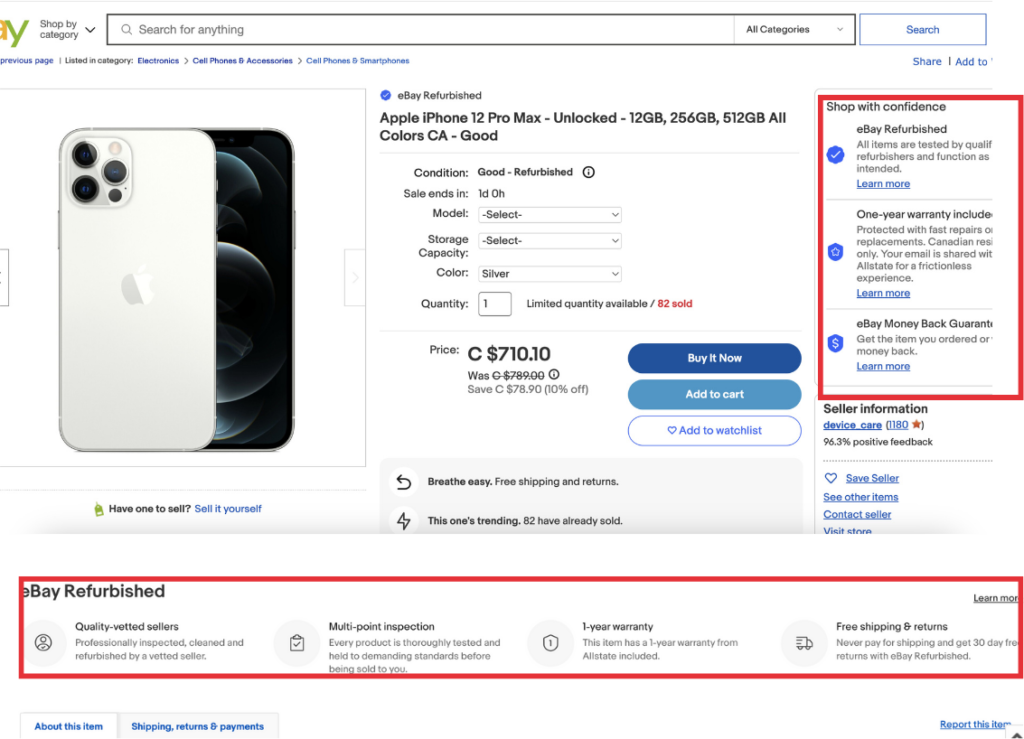
#8: Aesthetic & minimalist design
Before:
Information on the right is redundant as it is repeated in a later section on the bottom.
Solution (after):
Removed the redundant right section that is repeated later on the bottom section to make the product page more minimalistic.
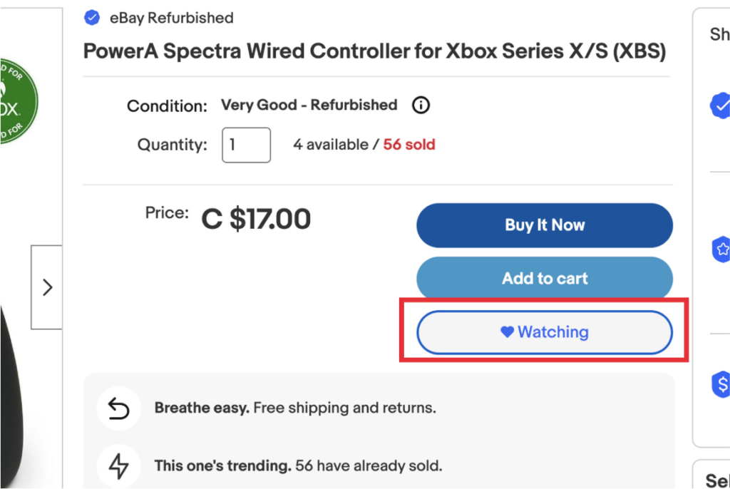
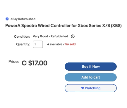
#1: Visibility of system status
Before:
The button remains as “Watching” after unselecting, despite the hover state showing that the item can be unwatched.
Solution (after):
As the user clicks on “Unwatching”, the system status now undergoes a change.
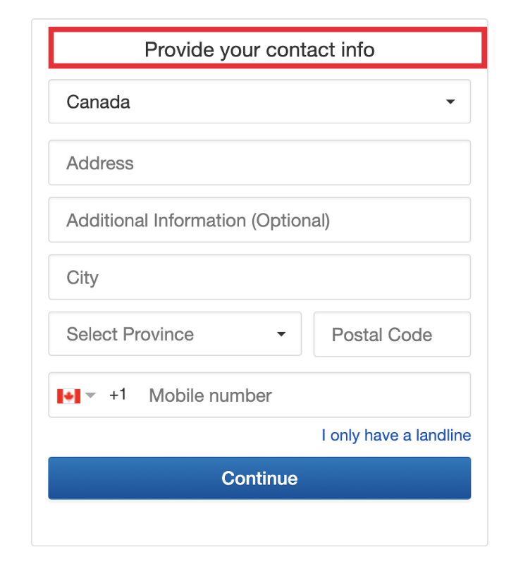
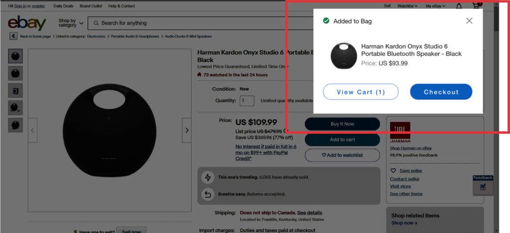
#6: Recognition rather than recall
Before:
When the user clicks “Add To Cart” on an item, they are redirected to another page to add their contact information, forcing them to repeat redundant steps.
Solution (after):
Have a pop-up notification that shows the user it is added to the cart so they have the option to checkout or stay on the same page.
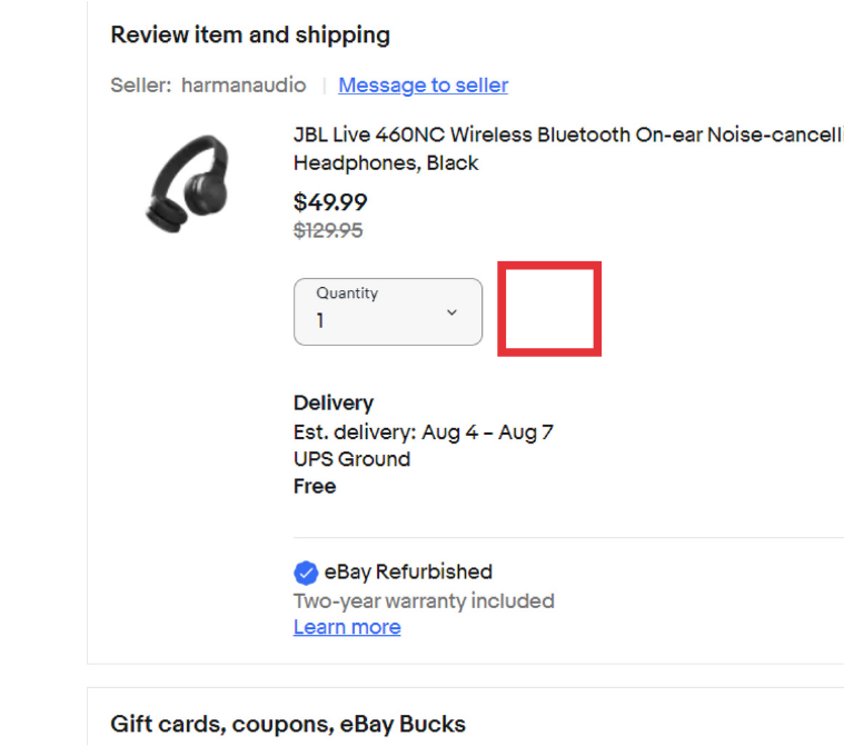
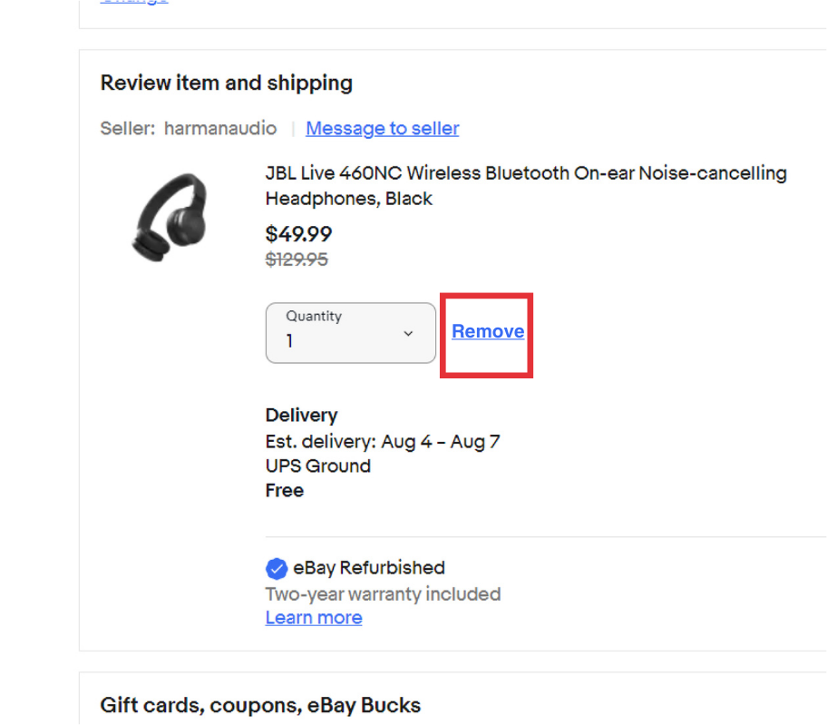
#3: User control & freedom
Before:
During the checkout process, the user does not have the option to easily remove an item they have in their cart.
Solution (after):
Add a remove link that is consistent with eBay beside the item quantity.