Heuristics offer guidance for assessing a design and recognizing potential design issues. It is an approach to testing a service by applying heuristics to uncover usability issues. In this project, I and my team will do a heuristic evaluation to assess the usability of the eBay website and suggest design improvements.
Heuristic evaluation contributes to enhancing key aspects such as:
Boosting user engagement
Reducing bounce rate
Increasing click-through rate
violation severity rating
Violation Severity
Rate of occurrence
Impact
Duration of Effect
Severity Rating Legend
0 = No Issue
1 = Cosmetic
2 = Minor Usability
3 = Major Usability
4 = Usability Catastrophe
Ebays Heuristic Violations
#4
Consistency and standard
#8
Aesthetic and minimal design
#1
Visibility of system status
#6
Recognition rather than recall
#3
User control and freedom
Project constraints
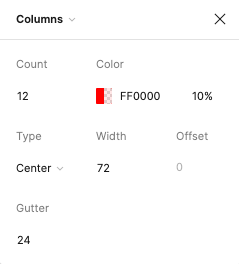
8 point grid system
Colors
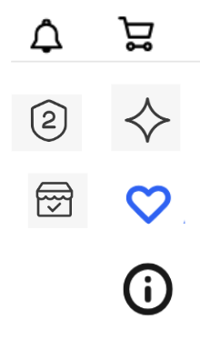
Iconography
Typography
Market Sans
Arial
Sans-serif
Helvetica Neue
Helvetica
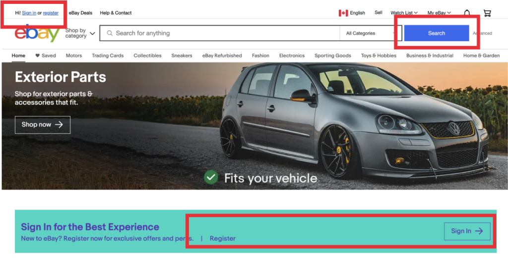
#4: Consistency & Standards
Due to inconsistent buttons & fonts, the user does not know where to go to access the main CTA.
Solution:
Moved the sign-in link to the top right side of the screen and make all buttons consistent. Make sign-in to eBay more streamlined with today’s e-commerce competitors.
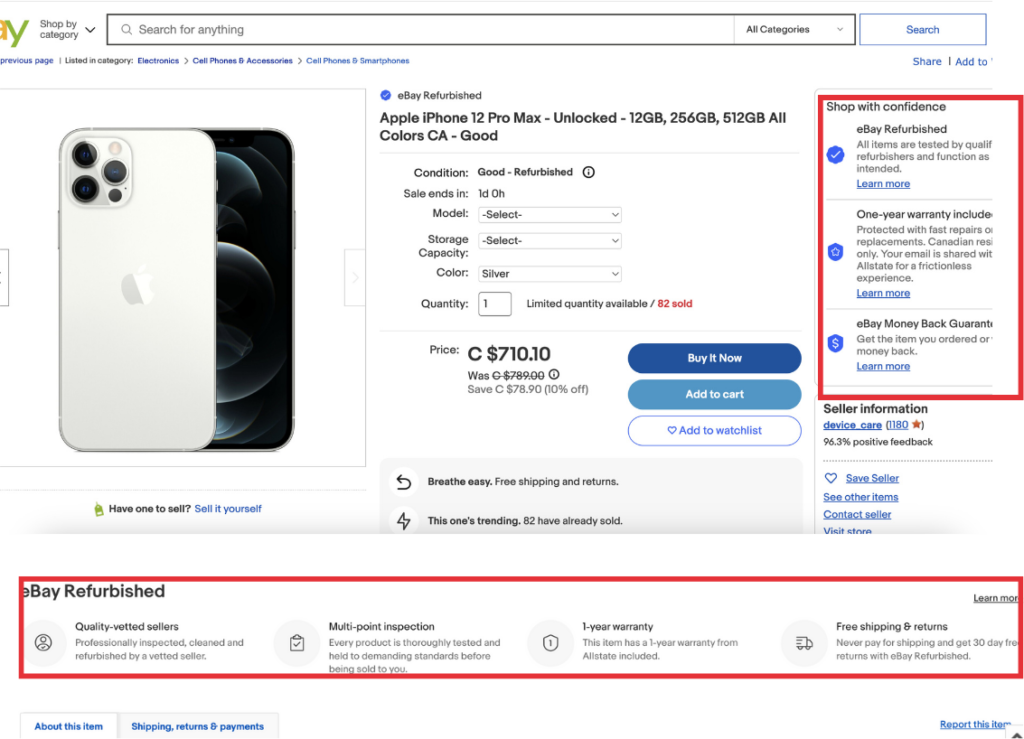
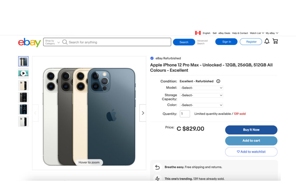
#8: Aesthetic & minimalist design
Information on the right is redundant as it is repeated in a later section on the bottom.
Solution:
Removed the redundant right section that is repeated later on the bottom section to make the product page more minimalistic.
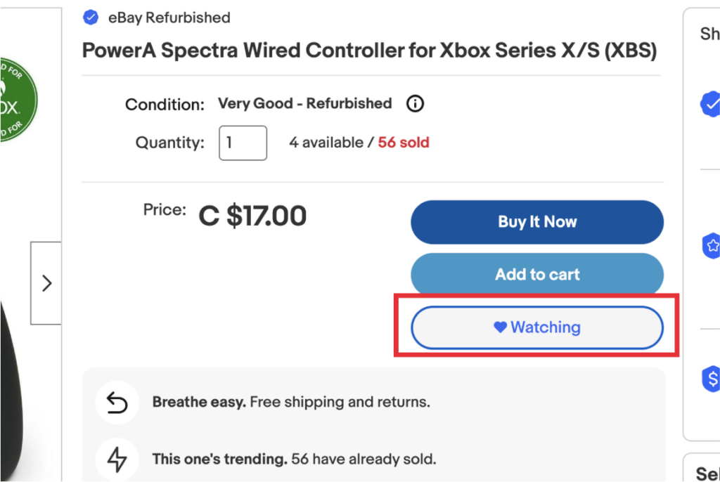
#1: Visibility of system status
The button remains as “Watching” after unselecting, despite the hover state showing that the item can be unwatched.
Solution:
As the user clicks on “Unwatching”, the system status now undergoes a change.
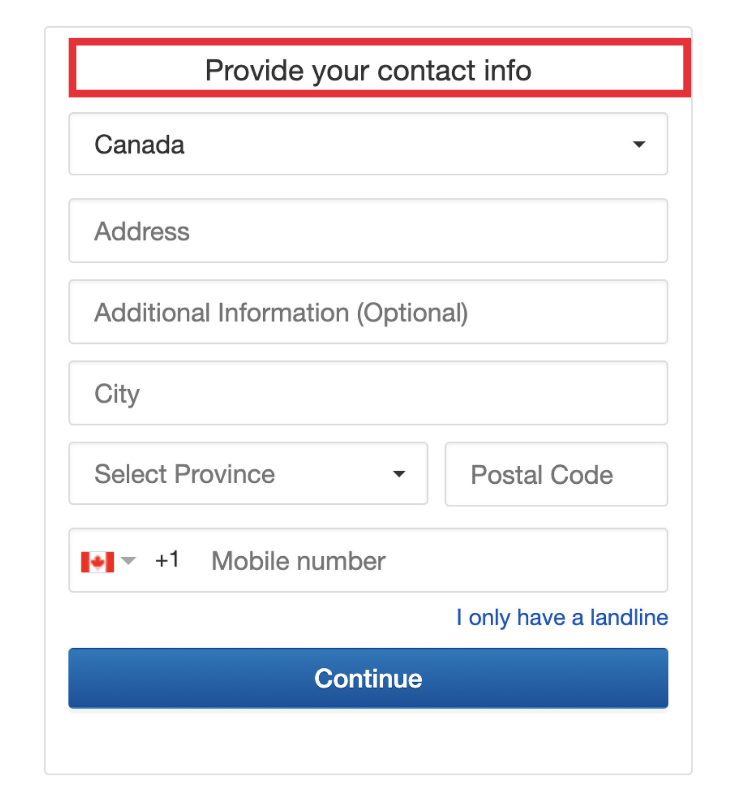
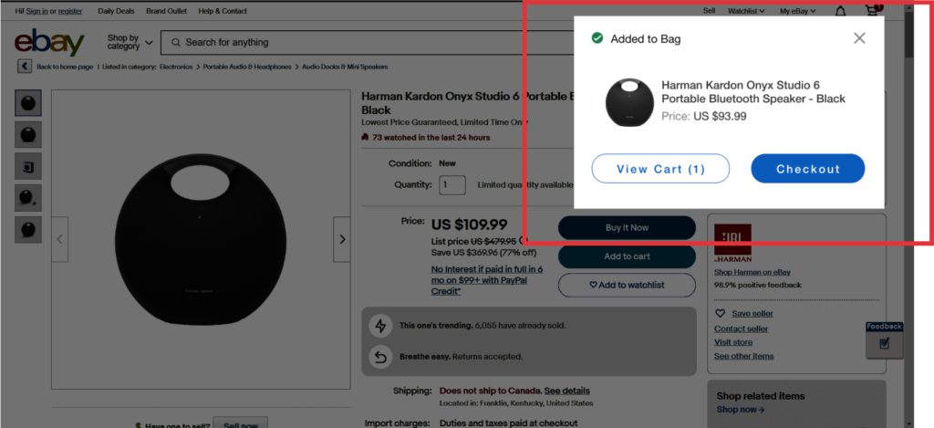
#6: Recognition rather than recall
When the user clicks “Add To Cart” on an item, they are redirected to another page to add their contact information, forcing them to repeat redundant steps.
Solution:
Have a pop-up notification that shows the user it is added to the cart so they have the option to checkout or stay on the same page.
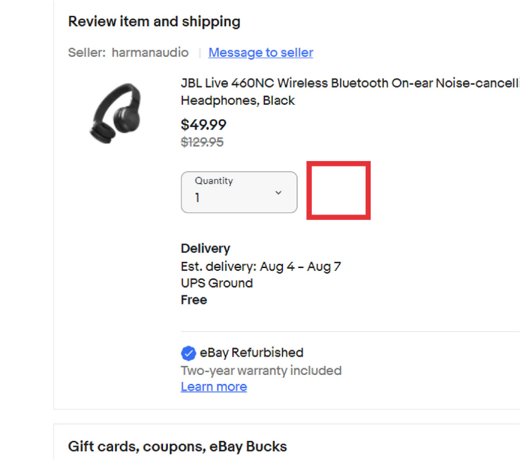
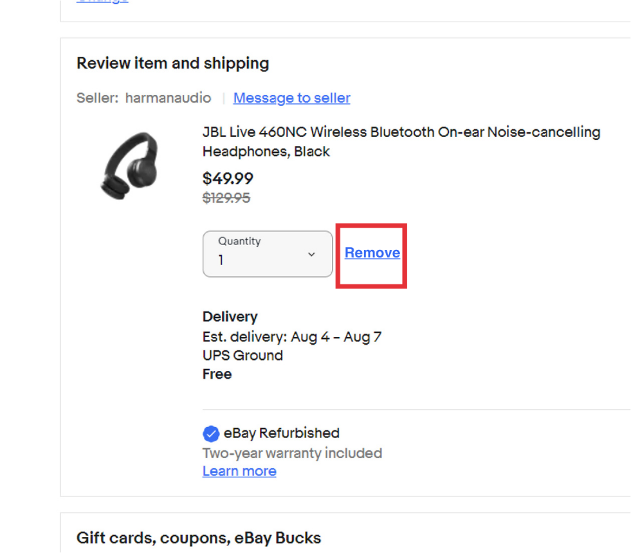
#3: User control & freedom
During the checkout process, the user does not have the option to easily remove an item they have in their cart.
Solution:
Add a remove link that is consistent with eBay beside the item quantity.