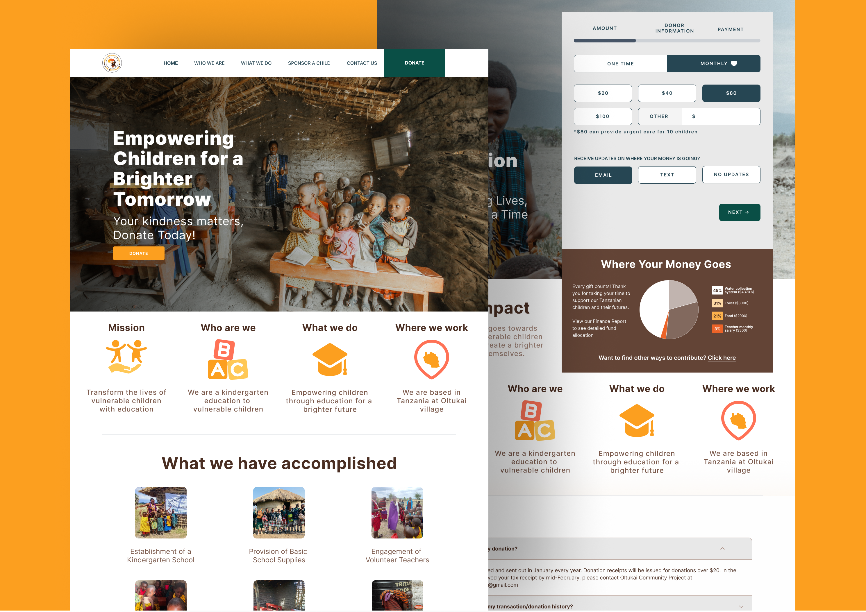
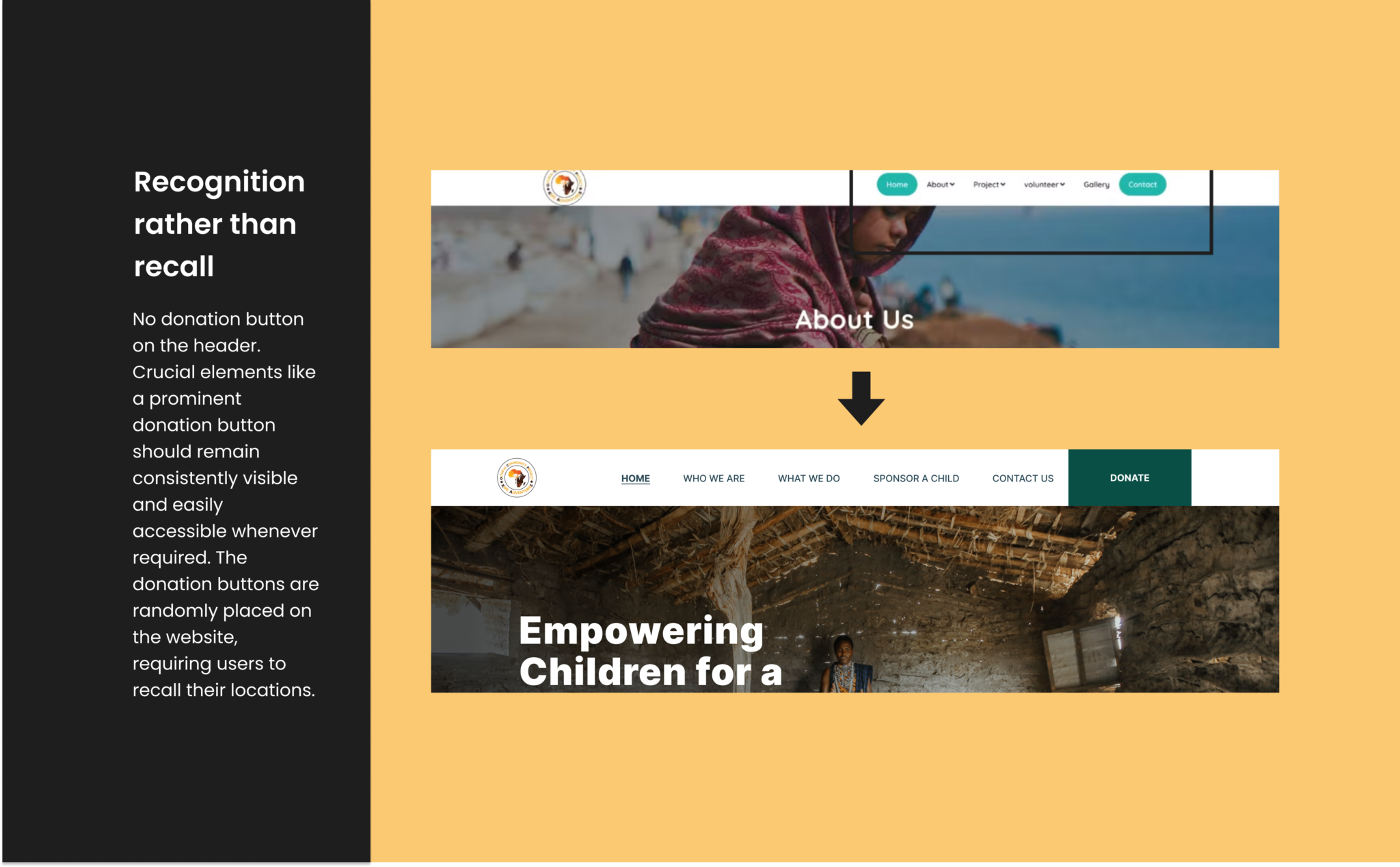
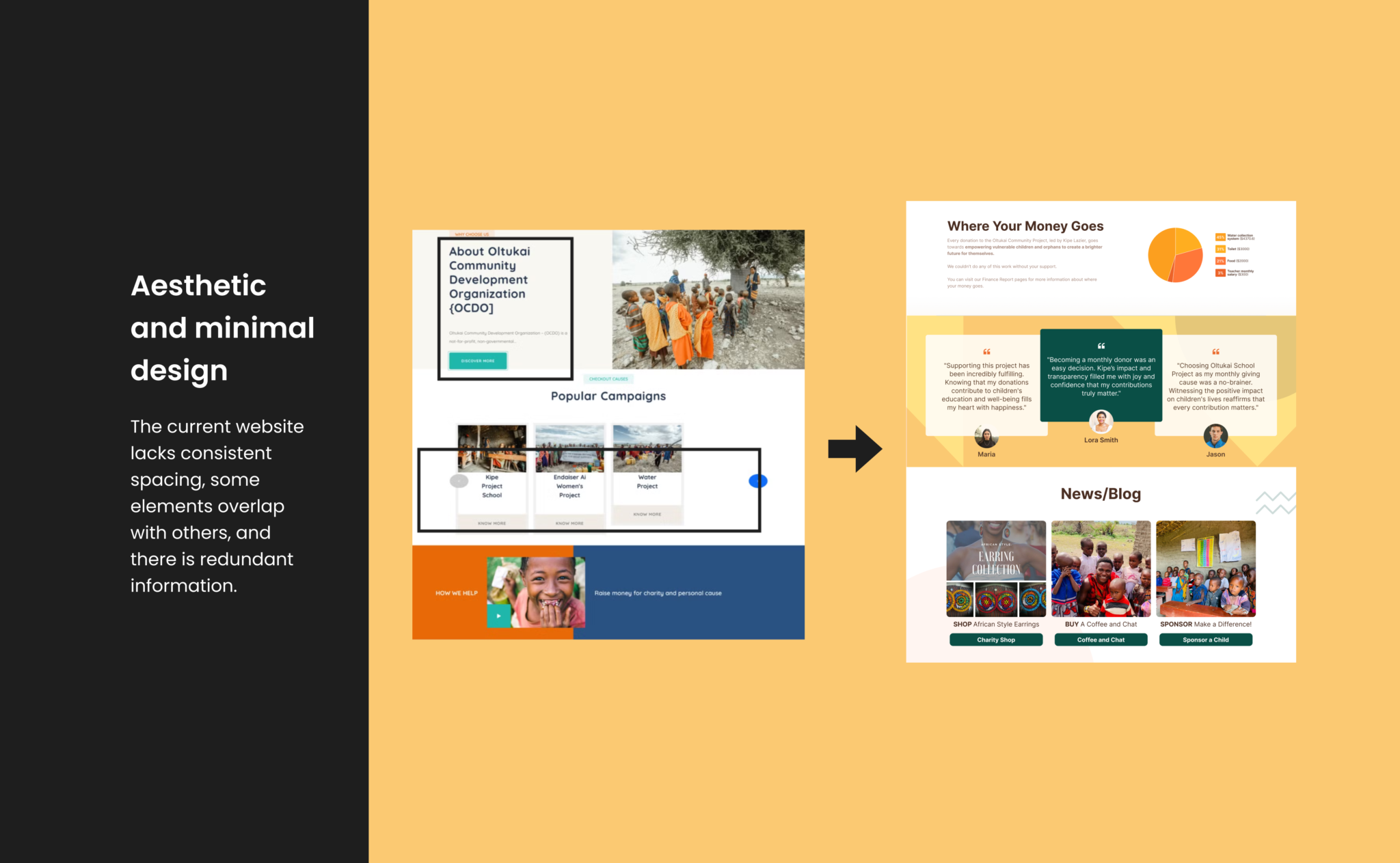
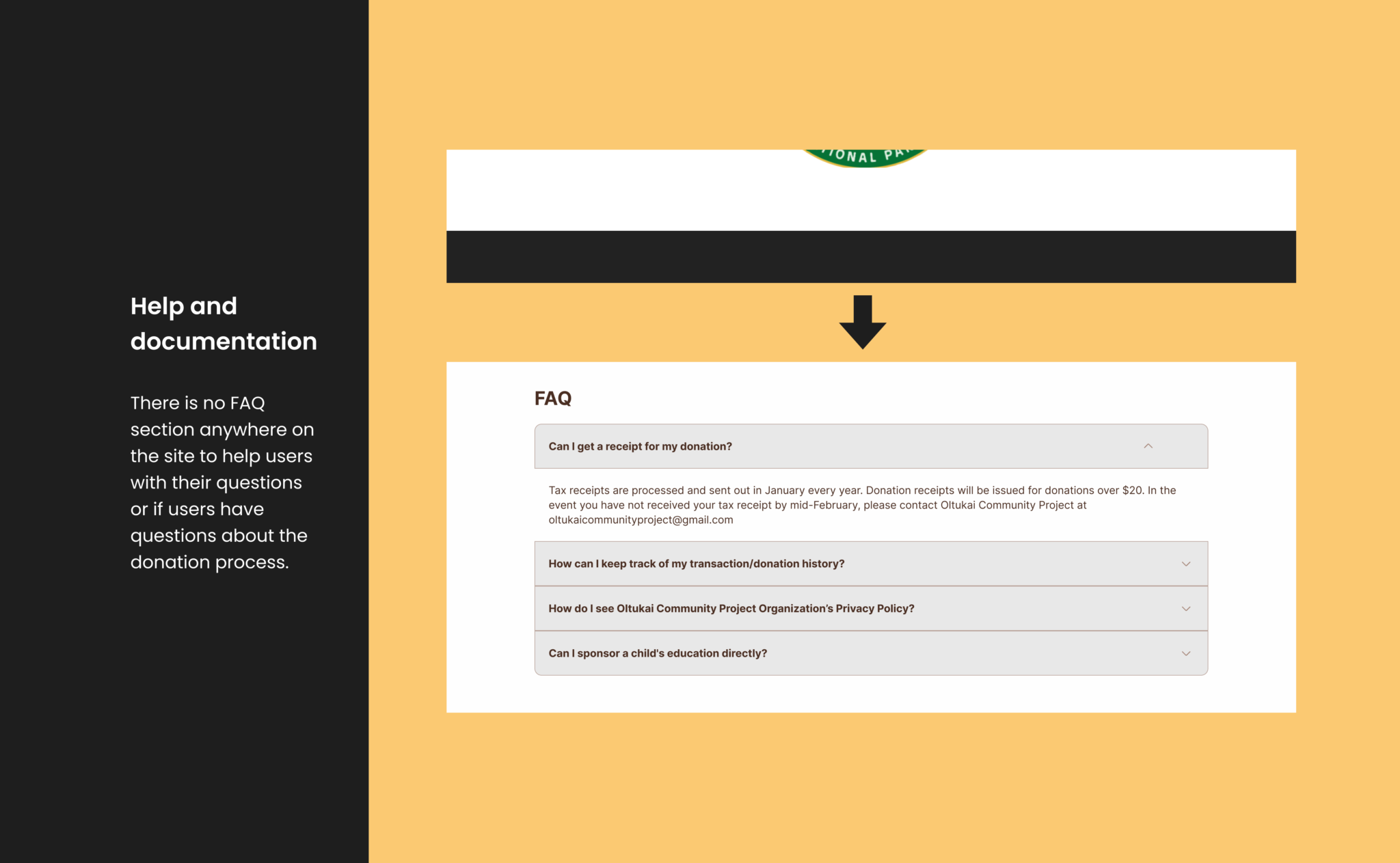
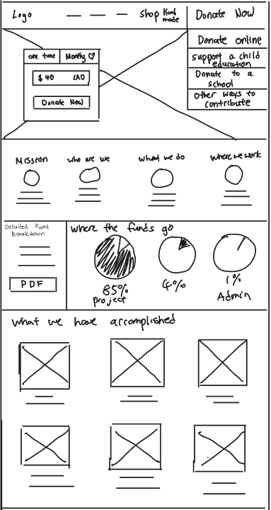
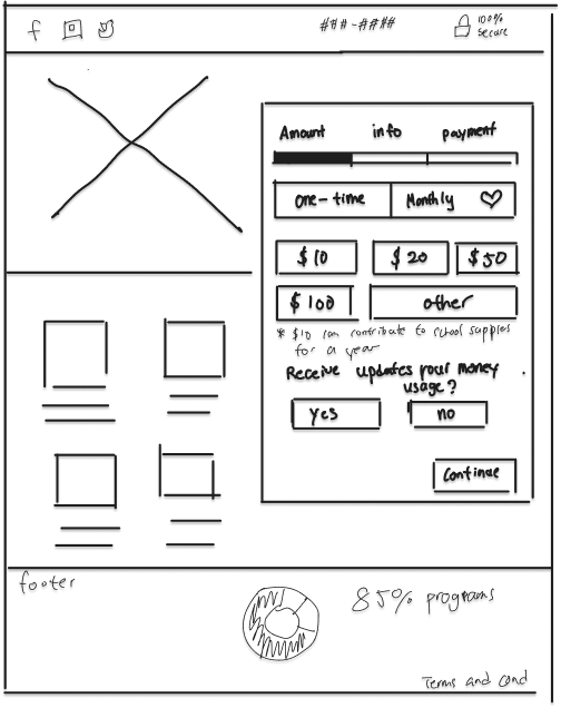
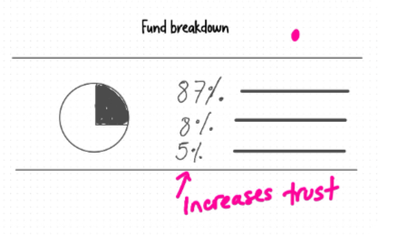
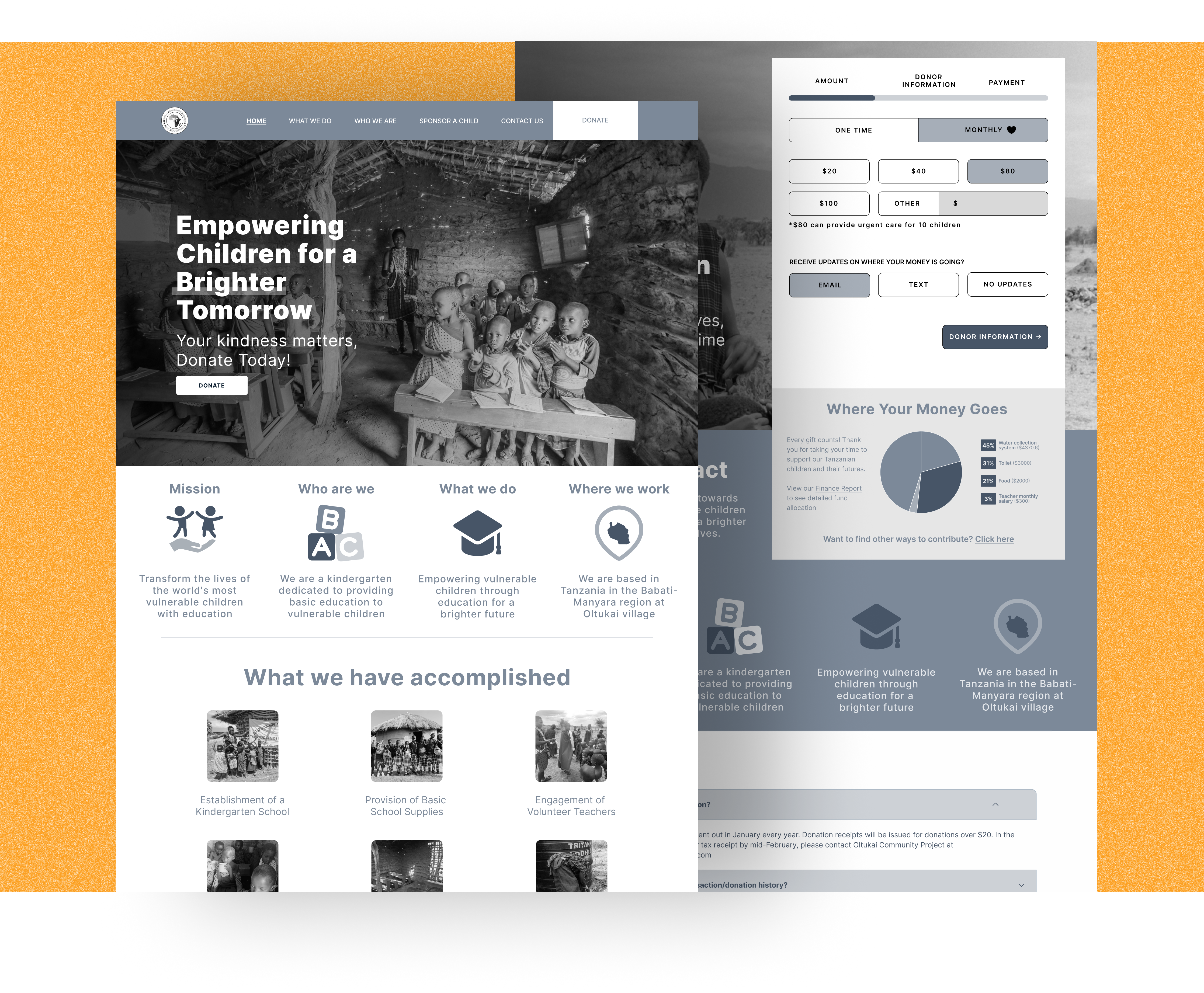
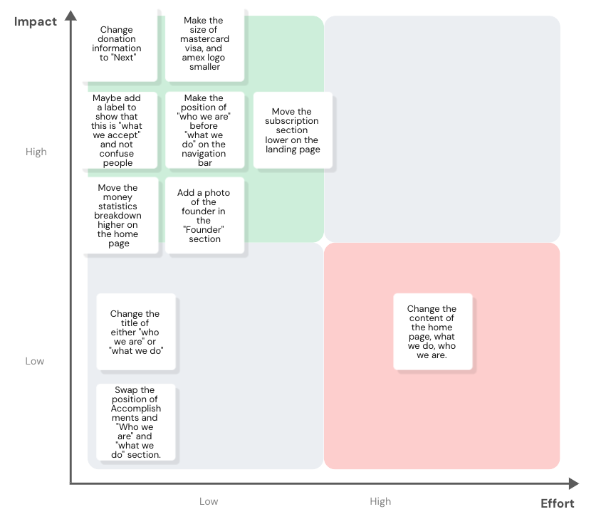
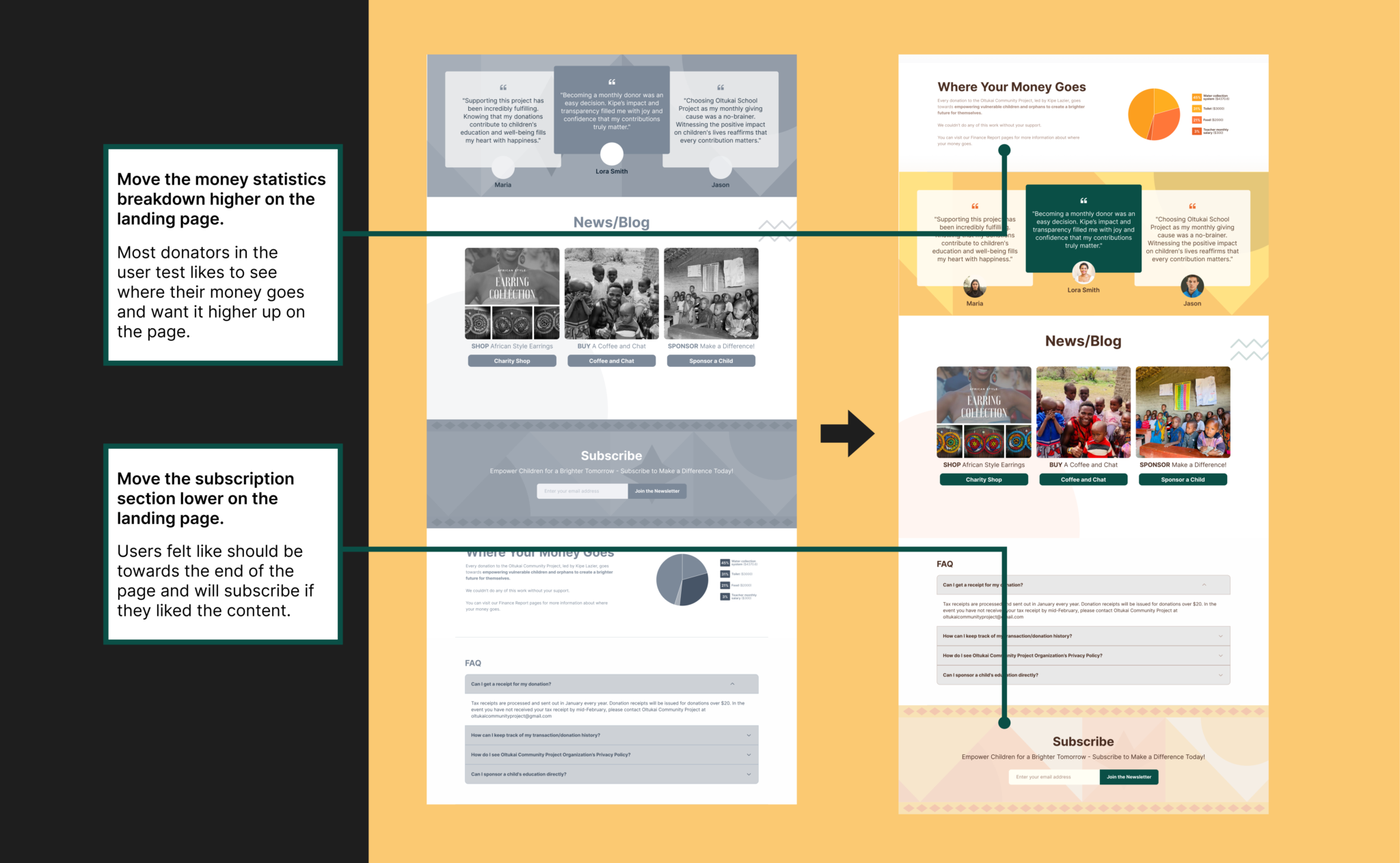
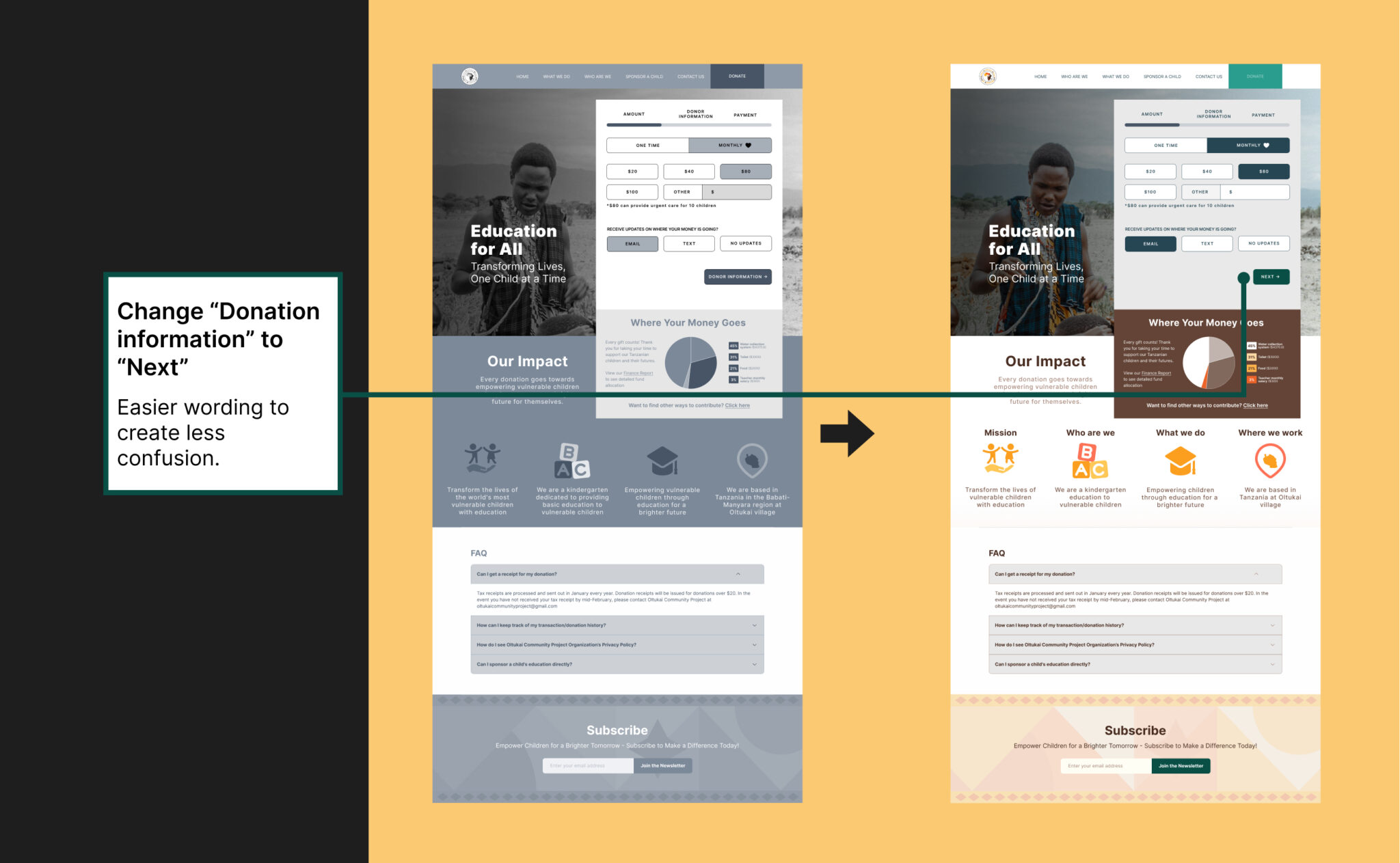
Oltukai community Development re-design

A re-design of the website and donation process of a small nonprofit organization that helps children in Tanzania. Did you know a cup of morning coffee from your local coffee shop can help support a Tanzanian children’s education for a year? My lovely teammate Raluca had a friend who currently lives in Tanzanian and works with the organization so we thought it would be great to help them improve their donation process and website.

Tools: Figma

Team: Lucy Zhang (myself), Raluca, Debora

My Role: UX research, Concept, Wireframe, Prototype

Timeline: 1 week sprint (Day 1: Research, Day 2: Sketch, Day 3: Wireframe & prototype, Day 4: User testing, Day 5: UI & Color injection)

Short on time?

You can view the prototype here. Scroll down to see the full case study.

Research

Problem

The lack of access to quality education hampers the children’s development and future opportunities, and also perpetuates the poverty and inequality cycle. Tanzania’s education system faces significant challenges:

2 Million children

5/10 Children

6%

Between 7 and 13 years old are out of school. 

Live in extreme poverty, surviving on less than $1.90 per day. 

Oltukai NGO is facing a shortage of online donations, receiving only 6% of its monthly budget to support 28 vulnerable children’s education. 

organization we are helping

The Otukai Community Development organization supports unprivileged children. They help children access healthcare, food, shelter, and education. The founder of the organization is a Tanzanian Maasai warrior named Kipe. Kipe’s own education was sponsored, and now, he wants to pass the kindness forward and give back to his community.

How might we....

How might we appeal to potential donors to increase online donations by encouraging consistent contributions that would make a lasting difference in the Oltukai children’s education and quality of life?

Improving the current website design

In order to understand why their current website is not getting enough donations, we did a heuristic evaluation on the current website to see if there are any spots for improvement. We then interviewed potential donors about their current reasons as to why they are not donating and what will make them want to donate. We found that the main goal is to increase potential donors’ trust and transparency on where their money is going. Using this information, we made our persona.

Persona

Who am I designing this for? Sandra is a persona I crafted from the chosen theme and insight. Sandra is the embodiment of the pain points, motivations, and behaviors I gathered from the user interviews. She represents my app’s target user.

Heuristic

What is heuristic evaluation?

Heuristic evaluation in UX design is a method where usability experts assess a digital product or interface against a set of established usability principles, known as heuristics, to identify and address potential usability issues. Performing a heuristic evaluation on the current website will give us insight as to what usability problems the current website has and areas that need to be improved.

Heuristic violations

1. Recognition rather than recall: No donation button on the header. Crucial elements like a prominent donation button should remain consistently visible and easily accessible whenever required. The donation buttons are randomly placed on the website, requiring users to recall their locations.

2. Aesthetic and minimalist design: The current website lacks consistent spacing, some elements overlap with others, and there is redundant information. 

3. Help and documentation: There is no FAQ section anywhere on the site to help users with their questions or if users have questions about the donation process. 

Sketches

After gathering some UI inspirations from other donation websites, I started doing some exploratory sketches exploring potential ideas for the pages on the updated website. Then I went on to draw the final sketches(solution sketches) of what each screen in my prototype would look like. 

Initial prototype

After sketching out possible solutions, we made our initial prototype. The prototype are interactive grayscale wireframes.

user testing

We tested the website with 5 potential donors to get real user feedback. We watched how they used the site, looking for any issues and ways to make it better. Users were given a task to complete, and we asked them questions during the test.

Task: To explore website pages for organization’s understanding, and complete the donation process.

5 Testers

Sean

27 years old UX Designer

Vivian

32 Years old Animator

Samreen

25 years old Student

Shayan

29 Years old Designer

Valeria

25 years old Product Designer

Design Matrix

After User testing, we put the user critiques and suggestions into a design prioritization matrix to help identify design changes that have the highest amount of impact with the lowest amount of effort (since this is a 4-day sprint).

Final Prototype

Final Prototype after color Injection. Users can now find the donation button on the header, the donation process is smoother, and there are testimonials and statistics to give potential donors a sense of trust and transparency.

next project