Skintel
Pocket sized skincare expert
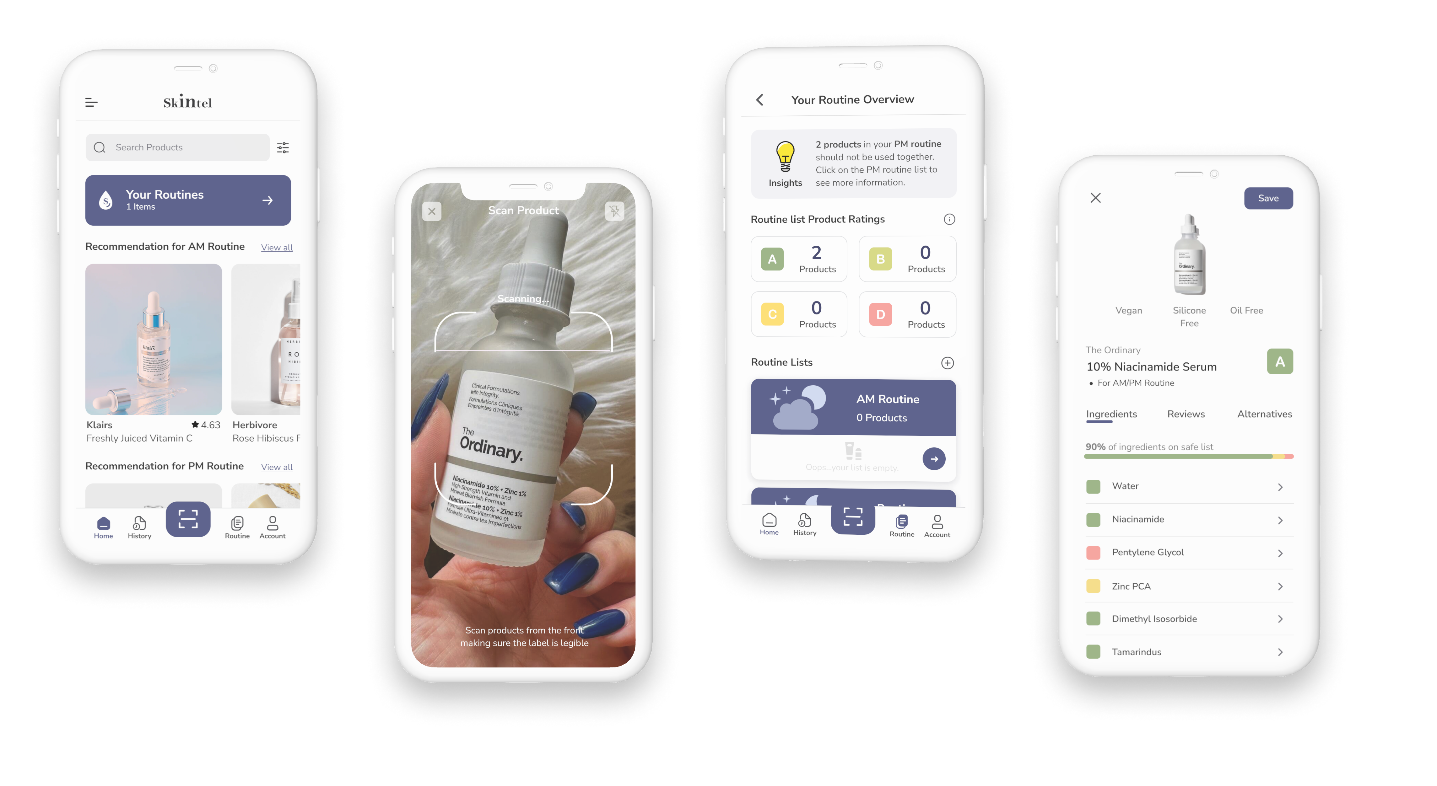
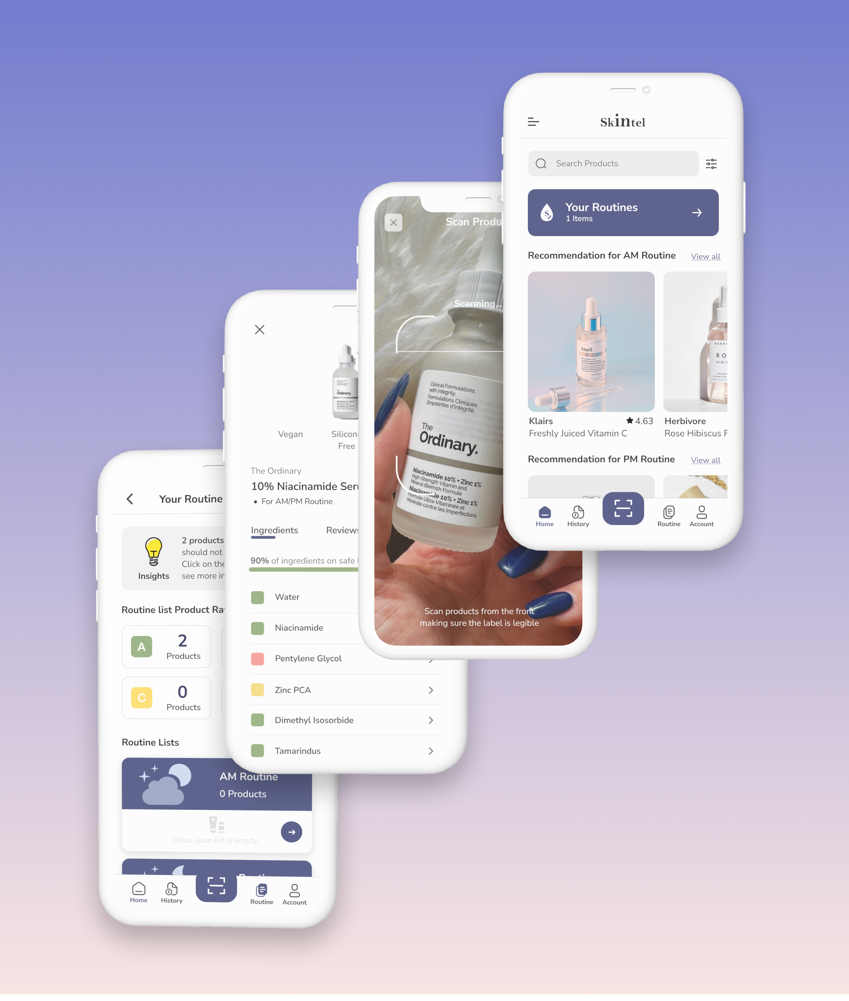
As the name suggests, a combination of “Skin” and “intel, it’s an app that scans personal care products, provides ingredient safety and effectiveness analysis, detects incompatible ingredients and products in your routines, and suggests products suitable for individual skin types (dry, acne-prone, sensitive). It aims to educate consumers on the scientific analysis of the ingredients in their personal care items and deeply understand what suits their individual needs, rather than succumbing to mass marketing influences.
Tools: Figma
Team: 1 UX/UI designer (myself)
My Role: UX research, Concept, Wireframe, Prototype
Timeline: 10 weeks (Research 4 weeks, Design & Testing 3 weeks, UI & Branding 3 weeks)
Short on time?
Problem
Consumers are now more conscious about the contents of their personal care products, yet they often find themselves perplexed by the ingredients and unsure if they align with their specific needs.
3x
Multiple chemical sensitivity has increased by over 300% in the past decade.
68 percent of those surveyed believe it is important to consider the ingredients in their personal care products.
Yet…81 percent of consumers said they often do not recognize ingredients on the label.
53 percent would be willing to switch to a different personal care product if they understood the ingredients in that product better.
Fun fact
Did you know? Unlike food and drugs, the FDA provides minimal oversight to cosmetics, banning the use of only 11 ingredients compared with 1,400 ingredients prohibited in Europe.
Question
How might we help mindful consumers understand the ingredients in their personal care products, avoiding products that are harmful and cause negative reactions?
Research
User interviews
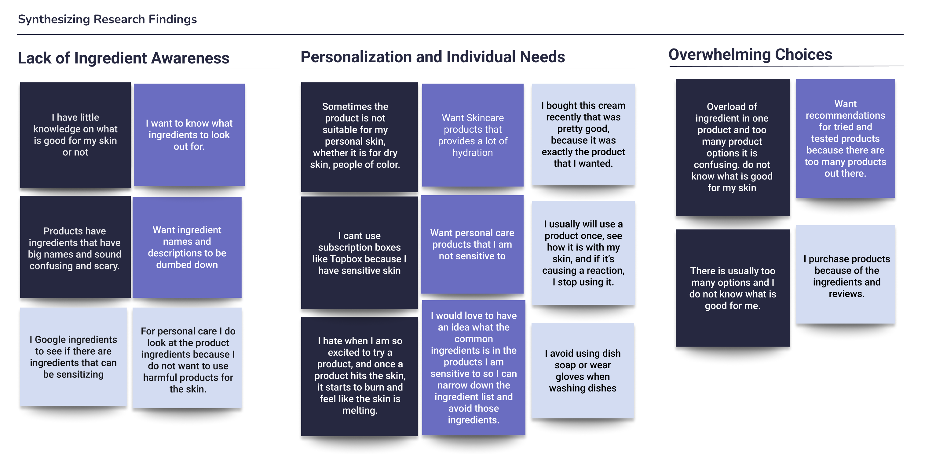
To understand the problem better, I conducted user interviews and organized the responses to my interview questions according to the participants’ pain points, motivations, and behaviors. Through this process, I identified compelling patterns and discovered common themes that resonated among the participants.


personalization and individual Needs
(CHOSEN THEME I FOCUSED ON)
Why: Because it is the theme with the most pain points from the user interview participants.
Insight: People often struggle to identify which ingredients align with their specific needs (skin type, allergies, sensitivities, preferences). Understanding which ingredients are beneficial or detrimental to one’s personal needs is crucial for selecting suitable products.
Persona
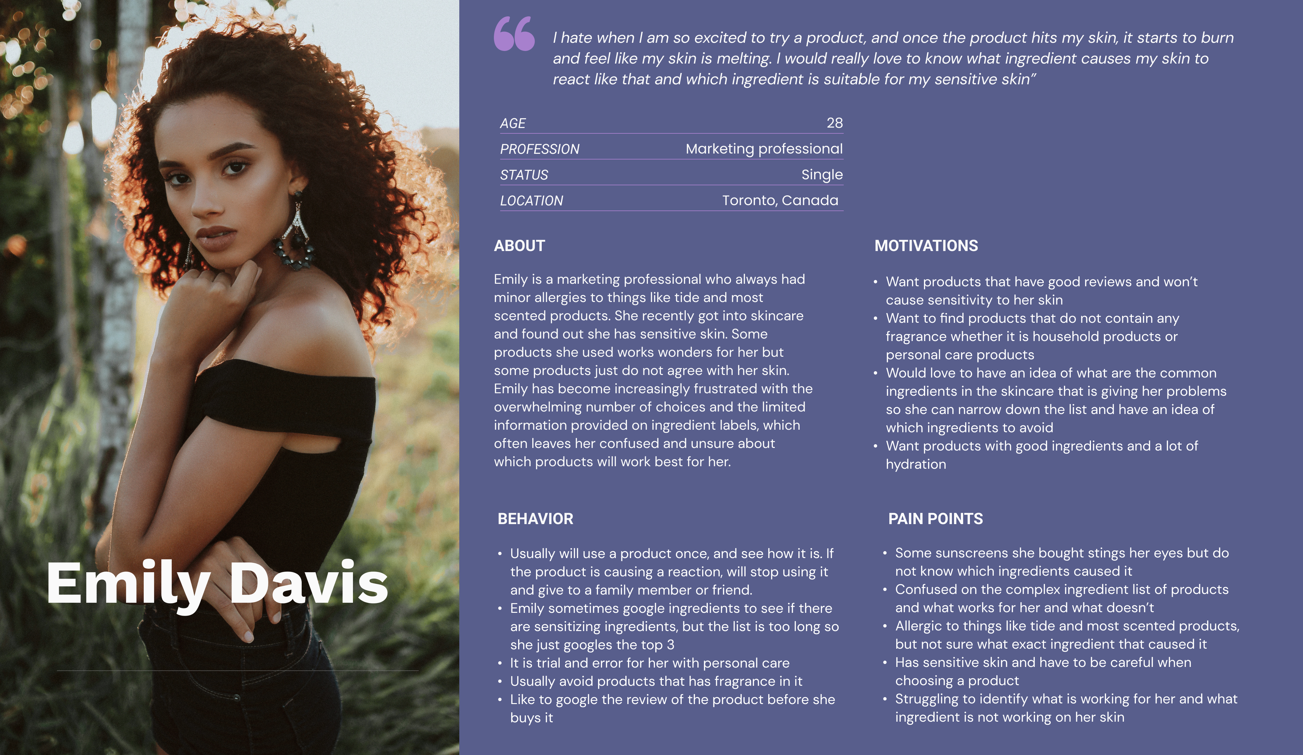
Who am I designing this for? Emily Davis is a persona I crafted from the chosen theme and insight. Emily is the embodiment of the pain points, motivations, and behaviors I gathered from the user interviews. She represents my app’s target user.
IDEation
User stories
User stories capture and communicate requirements from the perspective of end users or stakeholders. I captured 3 user stories in my task flow:
- As a mindful consumer, I want to be able to scan the products for the list of ingredients so that I won’t have to search for the ingredients one by one.
- As a mindful consumer, I want to the know ingredients that are in my personal care products, so that I will be more informed to buy products with mostly good ingredients.
- As a mindful consumer, I want to know if the ingredients in the products of my routine can be used together so that I won’t create harm to my skin and body if two ingredients can not be used together (because of chemistry!)
Task flow
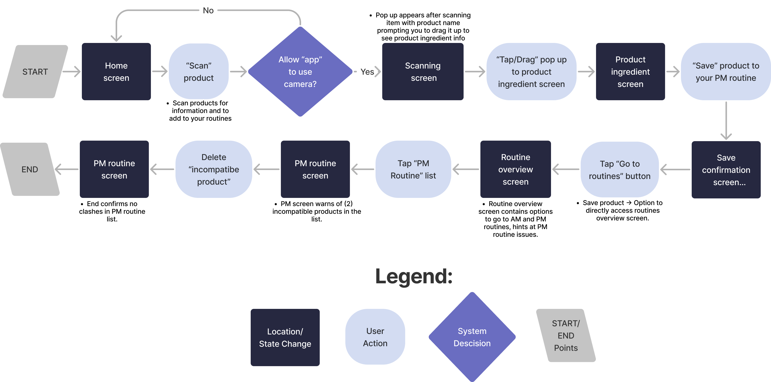
The task flow diagram shows the user flow involved in scanning products, looking at the ingredients analysis, adding it to a personal routine, and deleting an incompatible product. It captures the needs of all 3 user stories.
Sketches
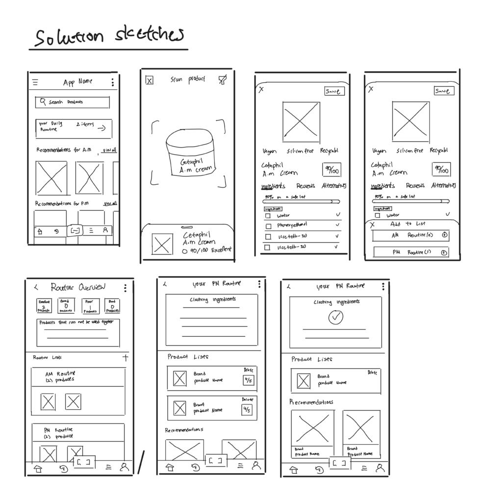
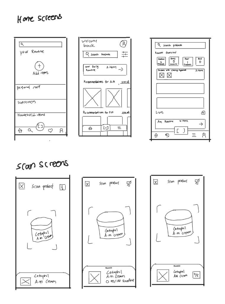
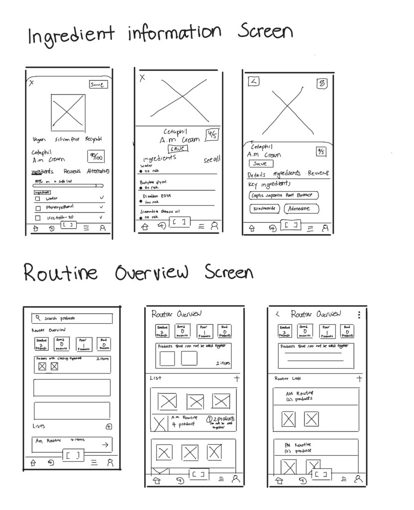
After gathering some UI inspirations from other similar apps, I started doing some exploratory sketches exploring potential ideas for the pages of my task flow. Then I went on to draw my solution sketches which are the final sketches of what each screen in my prototype will look like.
Wireframes

UI & brand development
Mood board
I first explored colors for my app and my brand. I put together a series of images to capture and communicate the overall feel, style, and aesthetics I wanted for my app before it was fully developed. Also, to source inspirations for my color injection.
I wanted my app to feel:
- Revitalizing
- Refreshing
- Calm
- Fresh
- Clean
- Relaxing
- Radiant

final colors picked
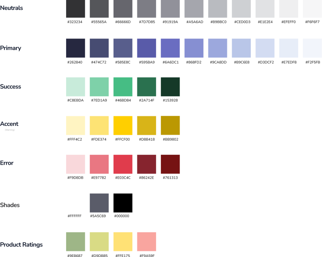
After trying out different sets of colors extracted from my mood board, these are the colors I decided to use for my app.
wordmark explorations
To emphasize the “Intel” aspect of Skintel, I wanted the “in” to stand out to enhance its visibility. I then began exploring wordmarks using different fonts and narrowed it down to my final wordmark. I selected my final wordmark because I believe it gives a feeling of elegance.
App Icon Explorations
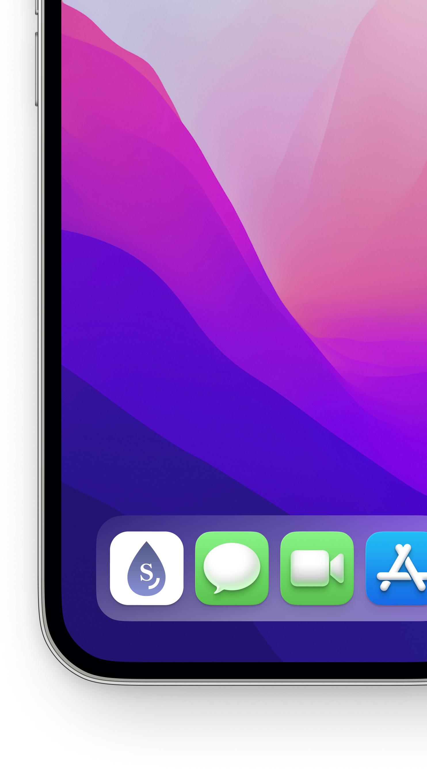
I started off creating many different variations of app Icons. The final app icon I chose features a white backdrop with a gradient logo. The teardrop design, reminiscent of skincare, is enhanced by embedding the same “S’ from my wordmark, aligning with my brand identity.
Final Prototype

Future Thinking
Tarot Cards of Tech
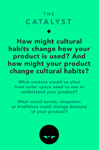
What social norms, etiquette, or traditions could change because of your product?
When people think of skincare, they think of bougie, which in some cases, is when you think of Kim Kardashian’s $630 skincare line. However, Skintel’s goal is to empower mindful consumers for healthier and more informed personal care choices, bypassing mass marketing influences. Some cultural norms that might change due to my products could be the misconception that expensive always means better, but that’s not always true, especially in the beauty and skincare industry. It could also educate about the potentially harmful effects of beauty trends. For example, in many cultures, people use products to whiten their skin, often containing toxic chemicals. Skintel aims to inform people about the potential harm these products could cause to their bodies and intends to shift cultural trends towards personalized, informed, and healthy personal care routines.